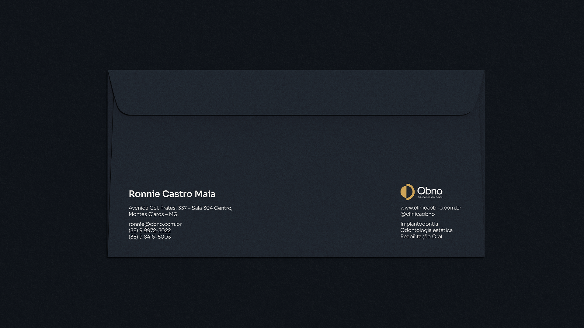
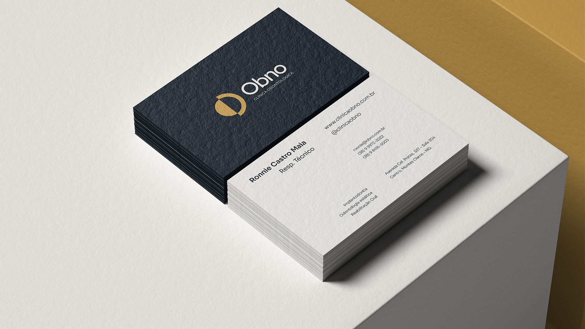
OBNO ODONTOLOGIA - MONTES CLAROS/MG
PT-BR
PT-BR
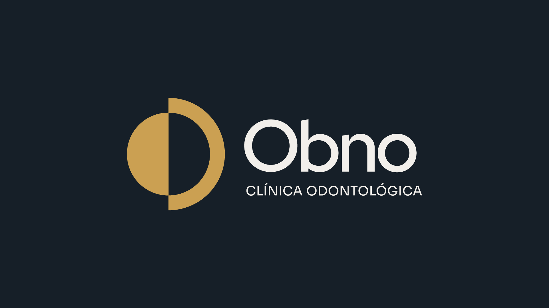
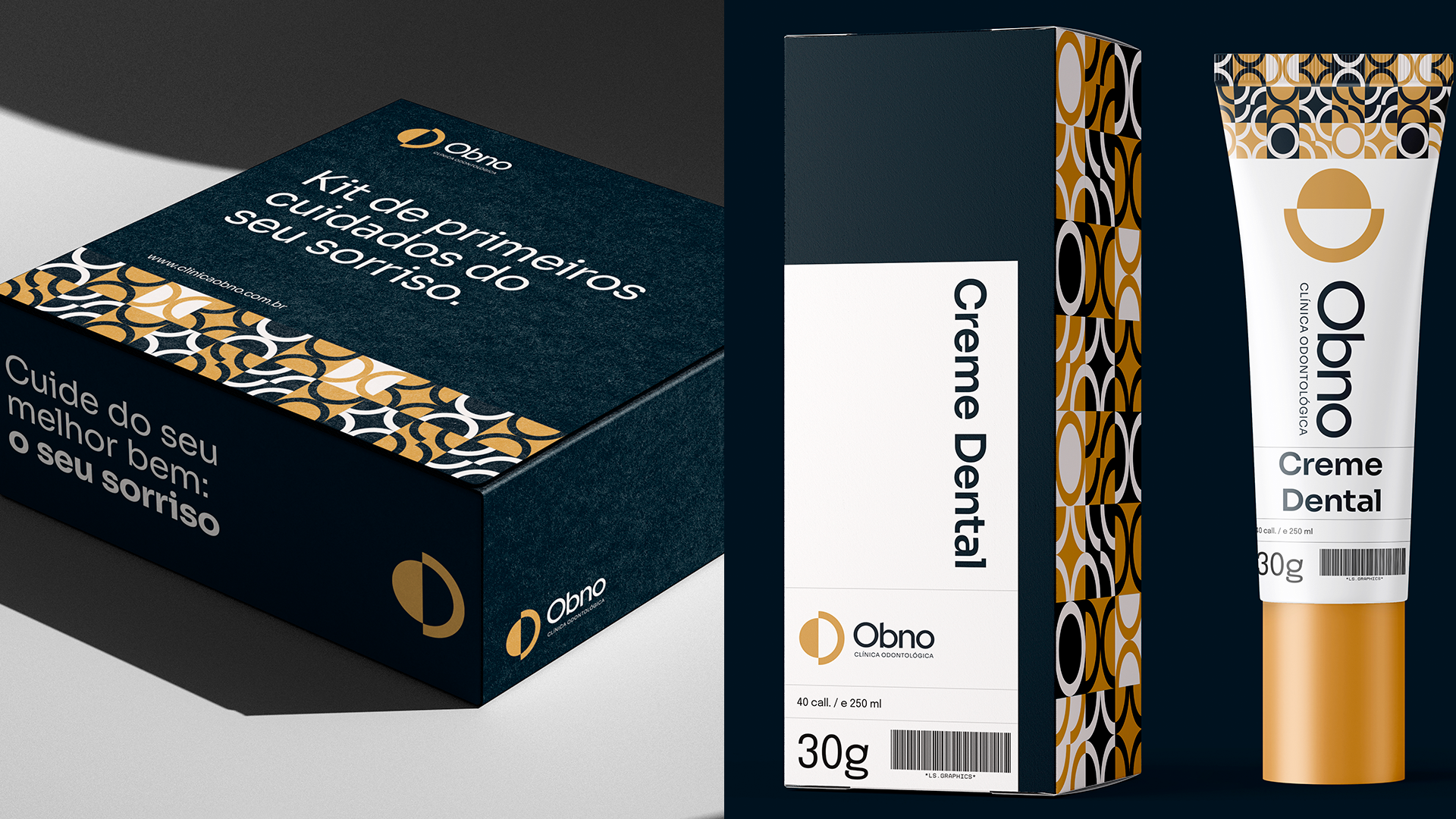
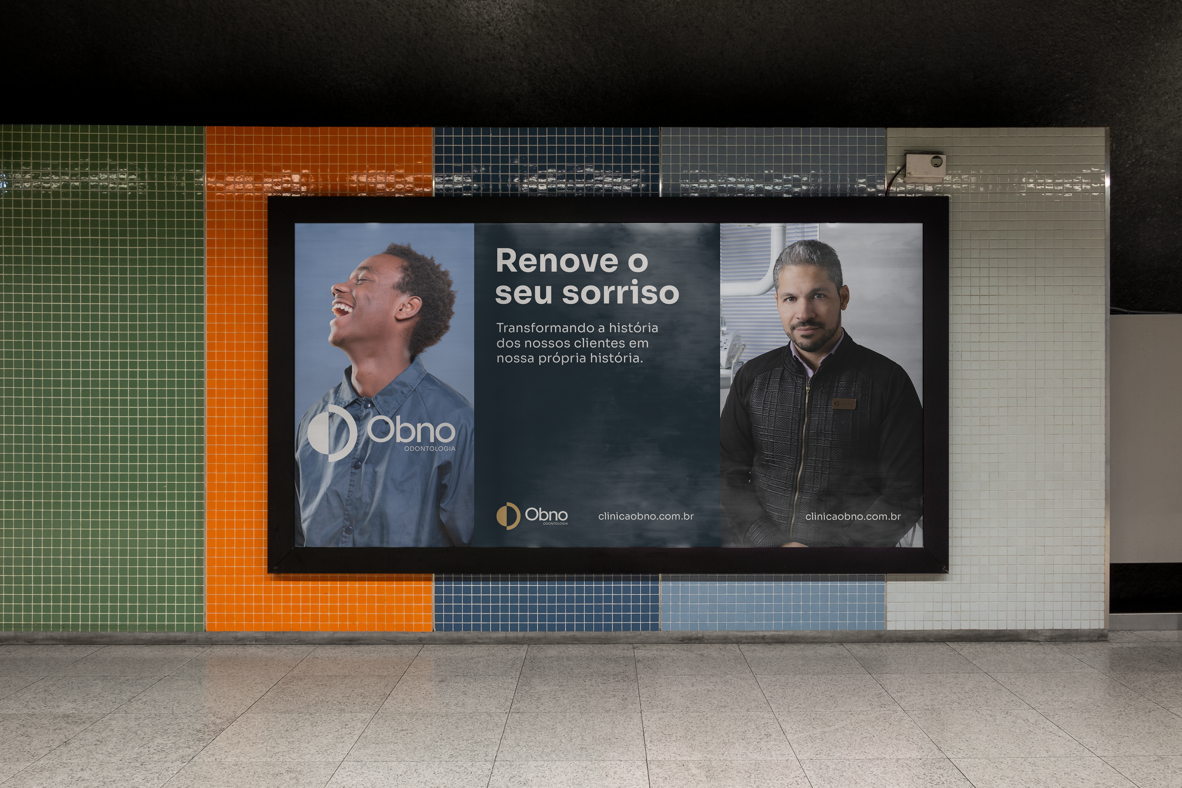
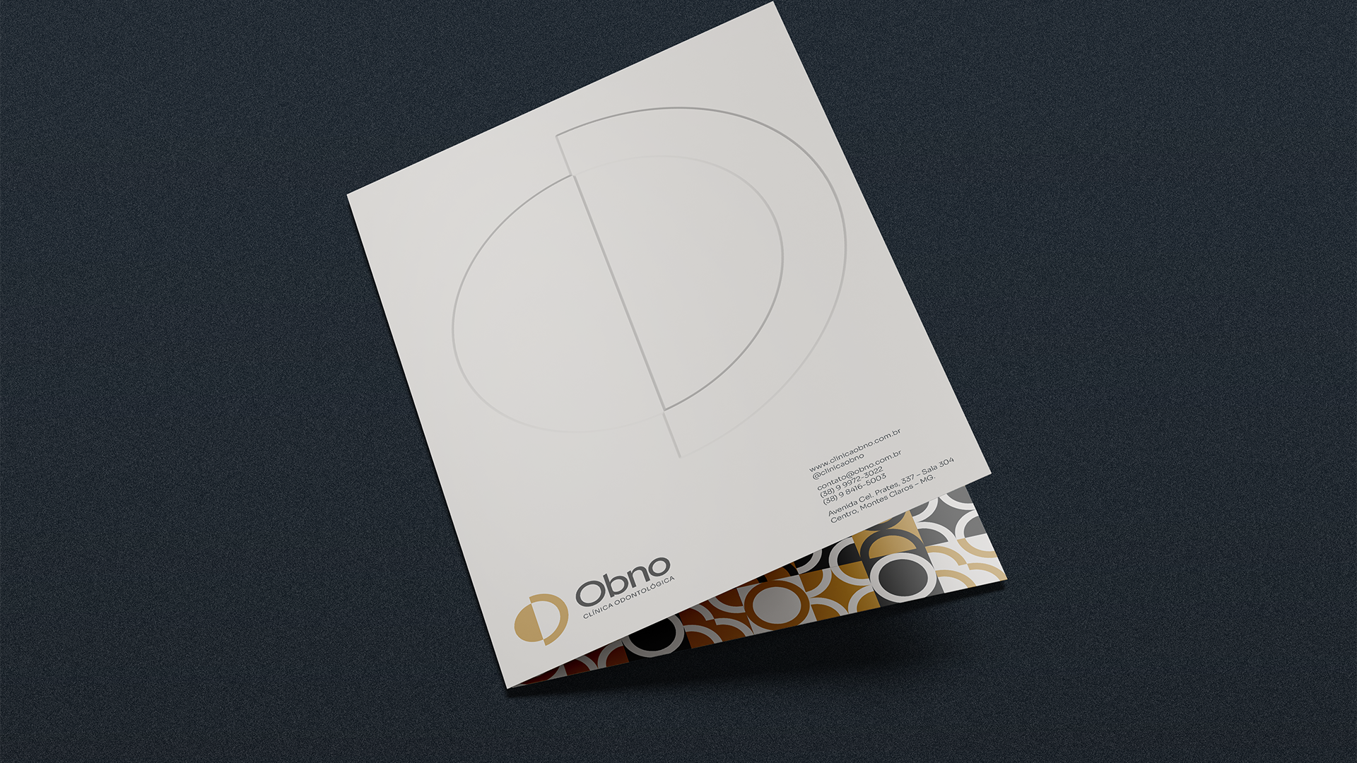
Elegante e profissional, sem deixar de ser alegre: essa é a Obno.
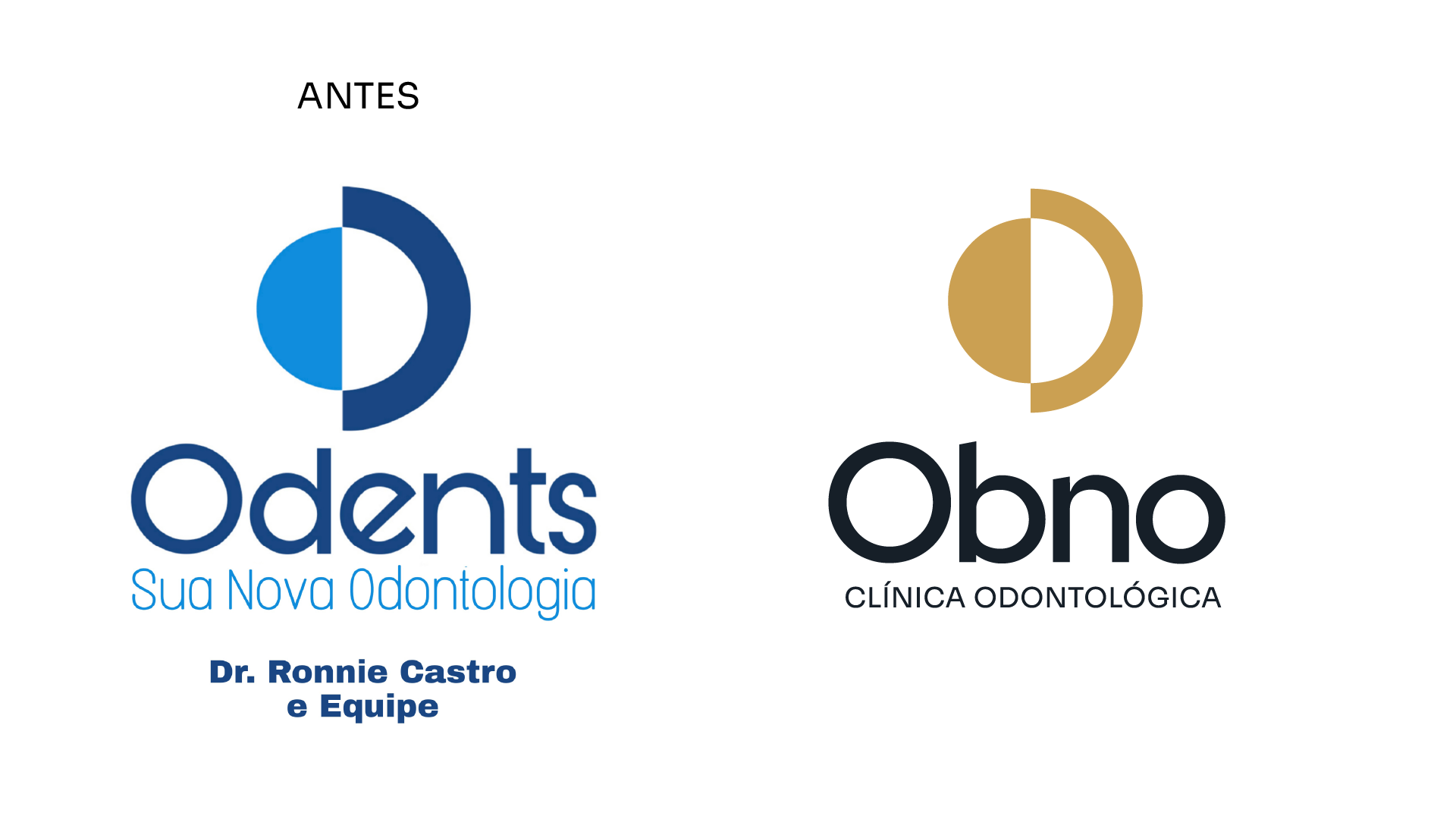
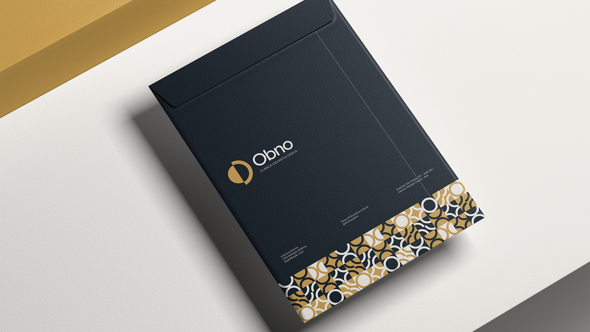
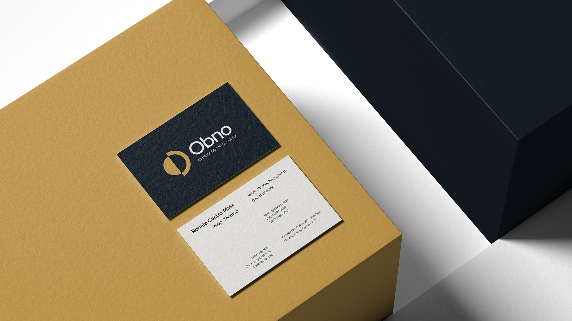
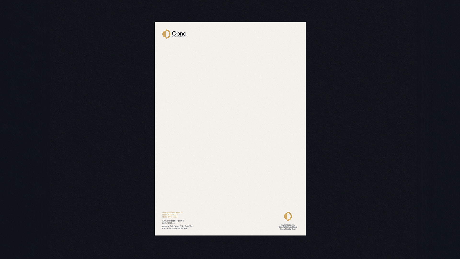
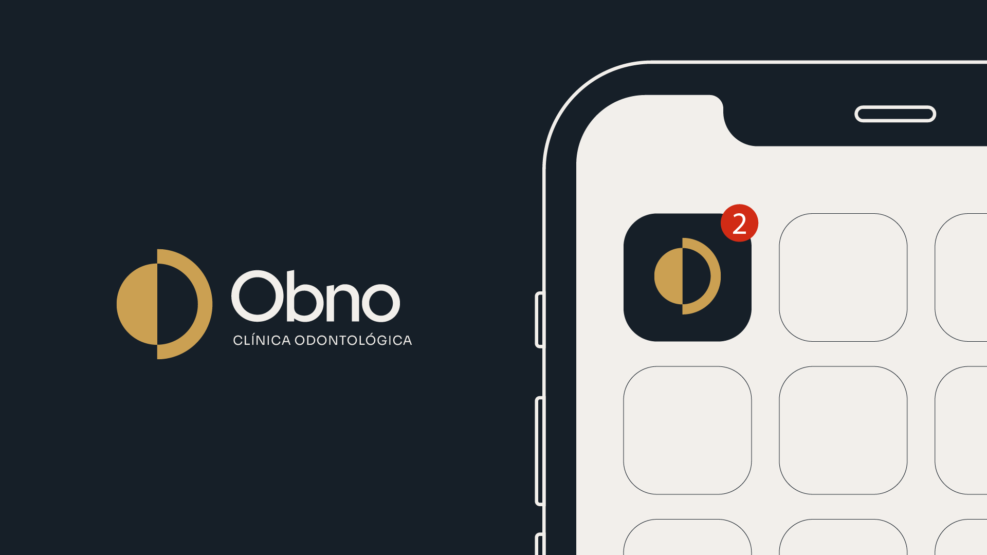
A silhueta do símbolo foi mantida, para trazer continuidade à marca. As cores, o nome e a estética, porém, agora se parecem mais com Ronnie e sua equipe do que com um "padrão de mercado".
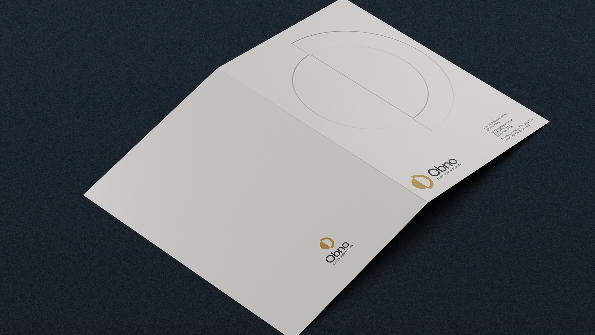
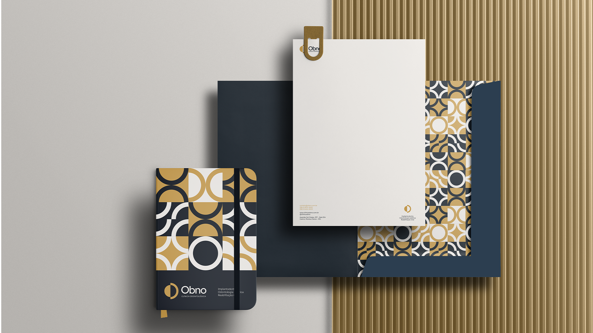
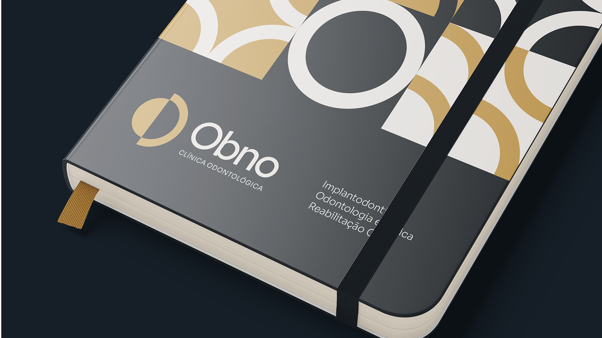
Sai o "azul com azul", entra o que já era possível ver no consultório, na decoração, na realidade. Entra um mosaico, desenhado especialmente para a marca, que mostra autenticidade e alegria.
A Obno renova.
E dá pra sentir só de olhar.
A silhueta do símbolo foi mantida, para trazer continuidade à marca. As cores, o nome e a estética, porém, agora se parecem mais com Ronnie e sua equipe do que com um "padrão de mercado".
Sai o "azul com azul", entra o que já era possível ver no consultório, na decoração, na realidade. Entra um mosaico, desenhado especialmente para a marca, que mostra autenticidade e alegria.
A Obno renova.
E dá pra sentir só de olhar.
EN-US
Elegant and professional, while still being cheerful: this is Obno.
The silhouette of the symbol was maintained, to bring continuity to the brand. The colors, name and aesthetic, however, now look more like Ronnie and his team than an "industry standard."
Out goes the "blue with blue", in comes what was already possible to see in the office, in the decoration, in reality.
Enter a mosaic, designed especially for the brand, which shows authenticity and joy.
Obno renews.
And you can feel it just by looking.
Serviço/Service: Naming & Redesign de marca.
Serviço/Service: Naming & Redesign de marca.
Ano/Year: 2023
Brand Design: Pedro Gomes
Follow: @sou.pedrogomes
Follow: @sou.pedrogomes